Analysis of Magazine Advert
I looked through two MOJO music magazines and found two album advertisements that I really liked the look of. After that I analysed both advertisements in terms of colour, font, picture style and the effect that they create.
Along with analysing things like social media, star rating, quotes or reviews, the record compnay and how the alum title is displayed. I also took into consideration things like audience and did some further research on the magazine to see the kind of people they are targeting with their products.
One clear difference that I noticed when studying both of these advertisements is that the rock genre is so different to the pop genre, especially in terms of the kind of music being created today. I always thought the two were quite similar. Analysing two different genre album covers, and both from different periods of time was very helpful as I was able to get a better insight into how advertising has changed, and how singers and bands now portray their music albums now compared to then.
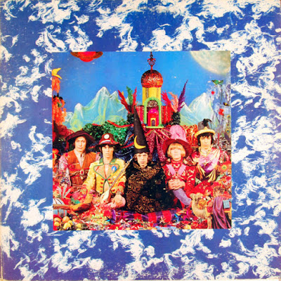
Modern day albums don't always have images of the singer or the band on the cover of the CD, as shown in 'The Killers; Wonderful Wonderful'. The image displayed in the advert is linking an object to what a song in the album may be about, or linking to the albums theme in general. Where as The Beetles have their entire band on the cover CD but they play around with background and release each cover with a new creative style.


Comments
Post a Comment